

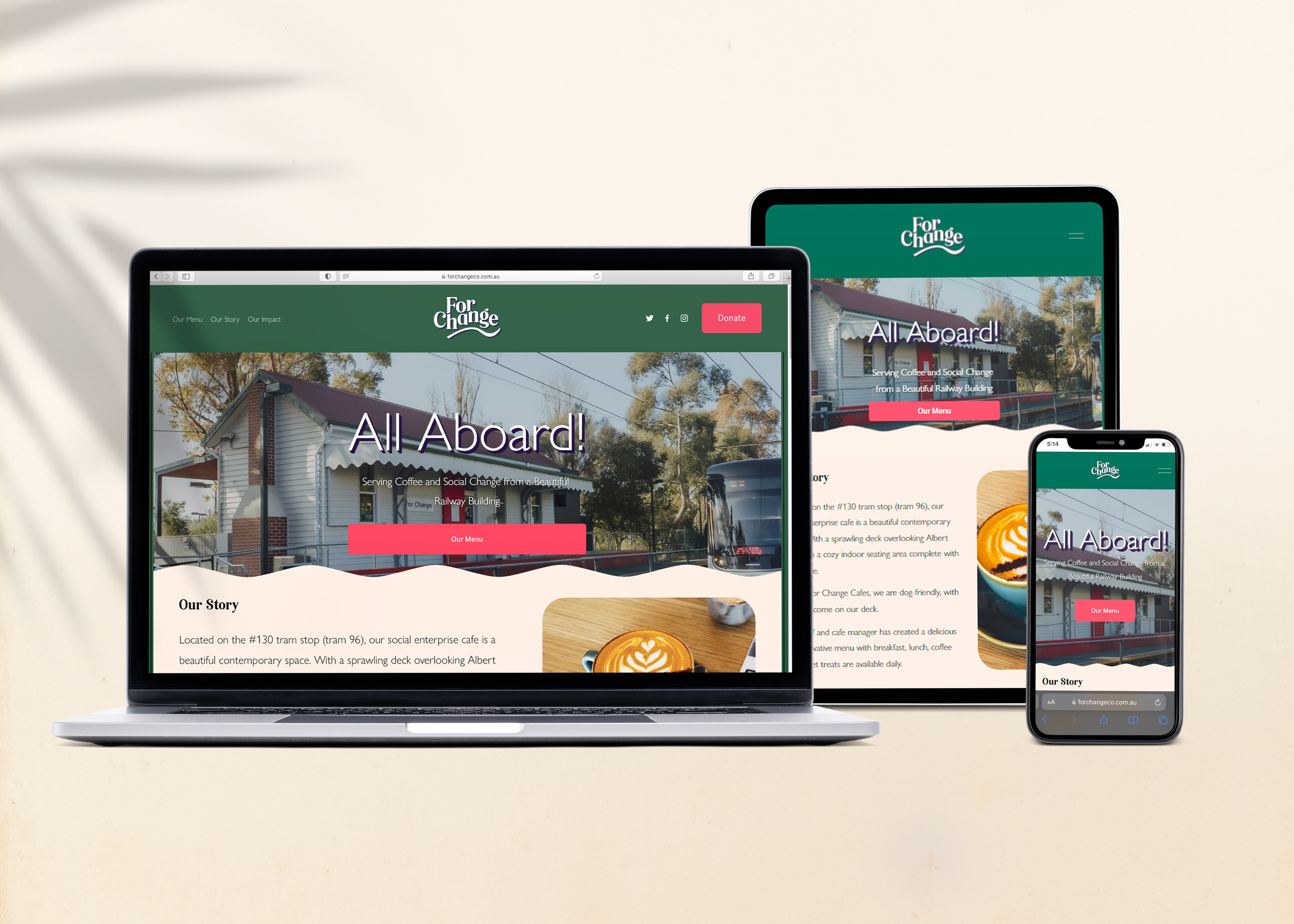
About the Café
For Change is a stunningly beautiful, inviting café in Middle Park with a large terrace overlooking Albert Park and a comfortable interior space with a charming fireplace. It is located within a picturesque
railway building in Middle Park near the #130 tram stop (tram 96).
railway building in Middle Park near the #130 tram stop (tram 96).
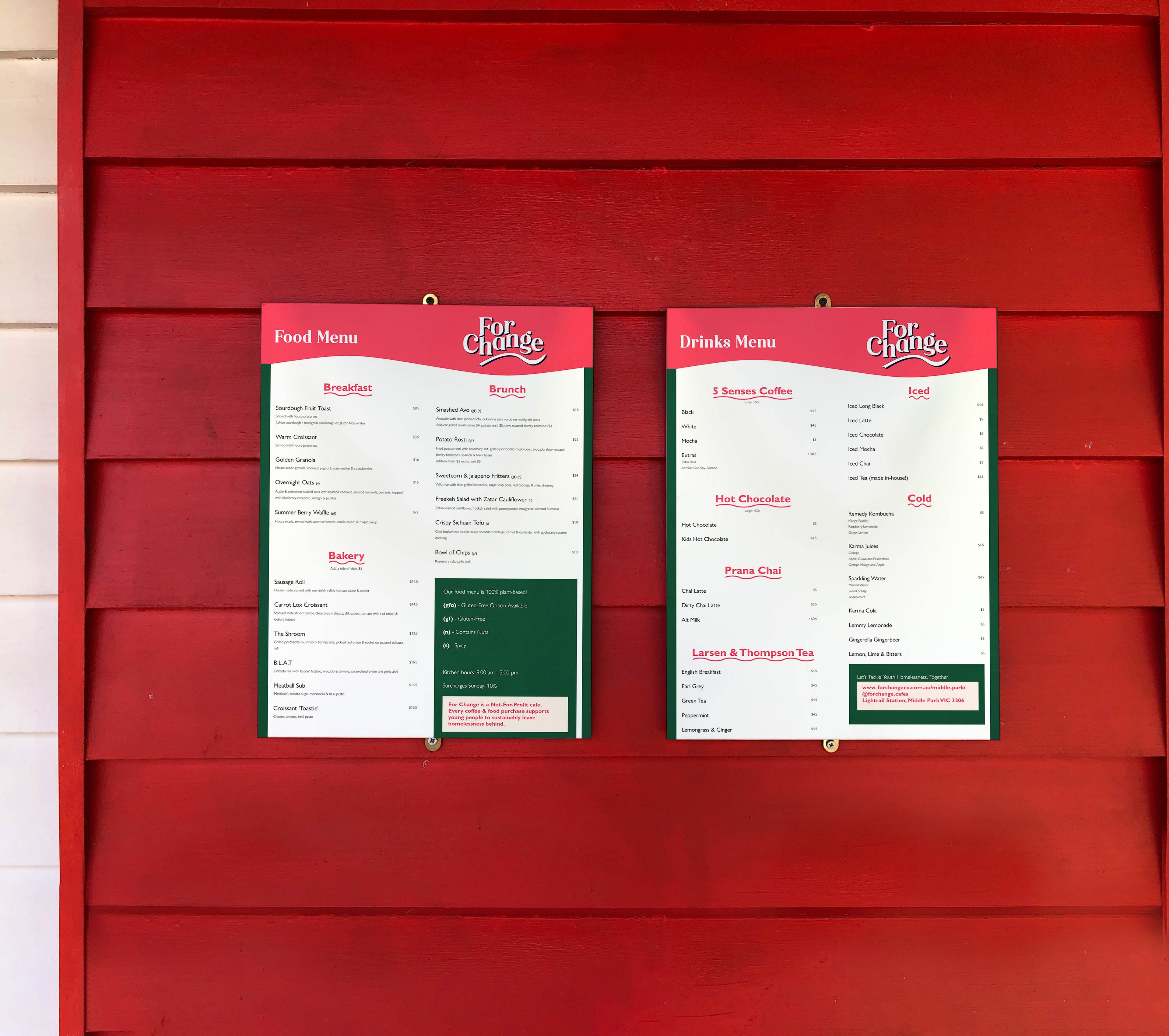
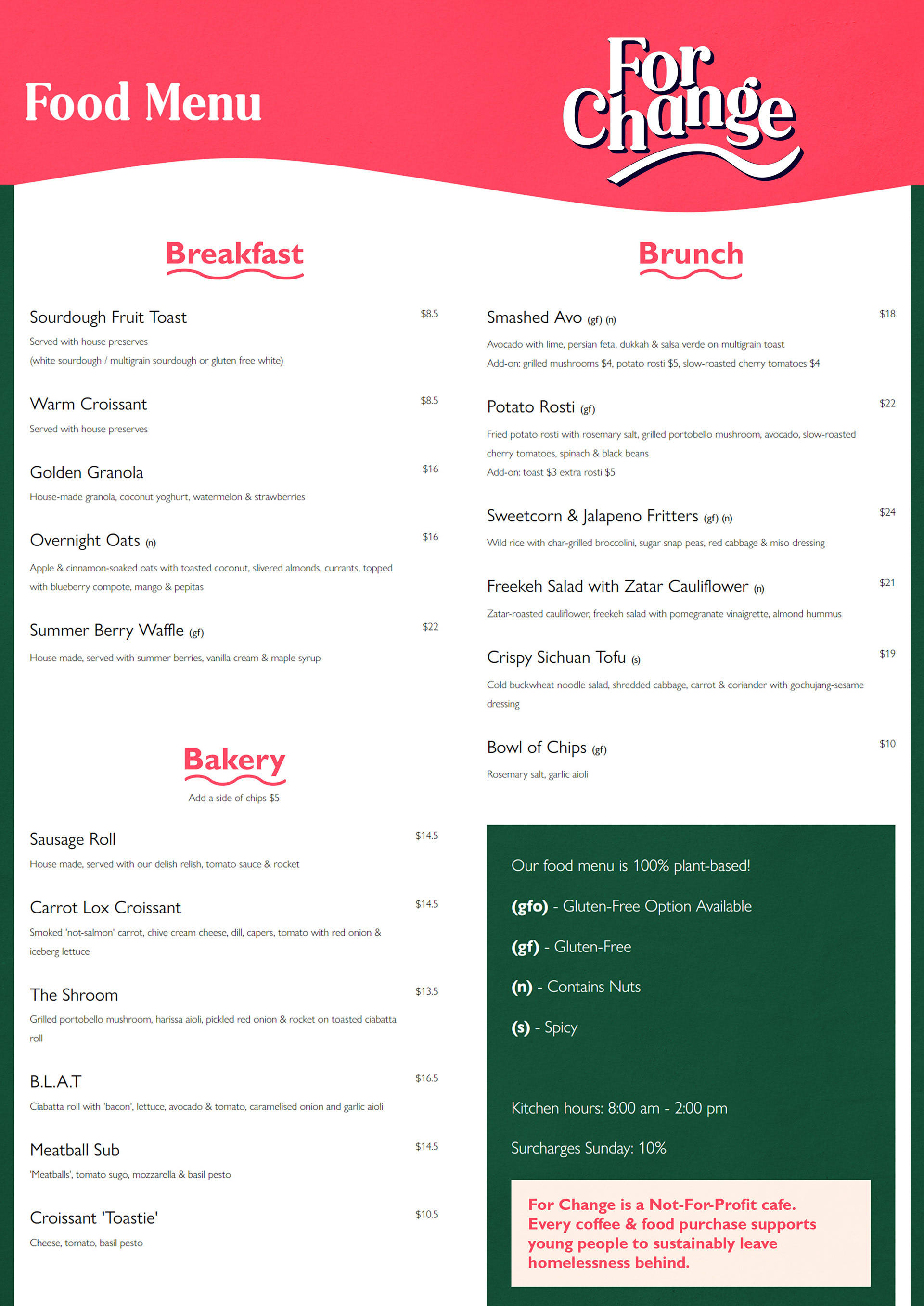
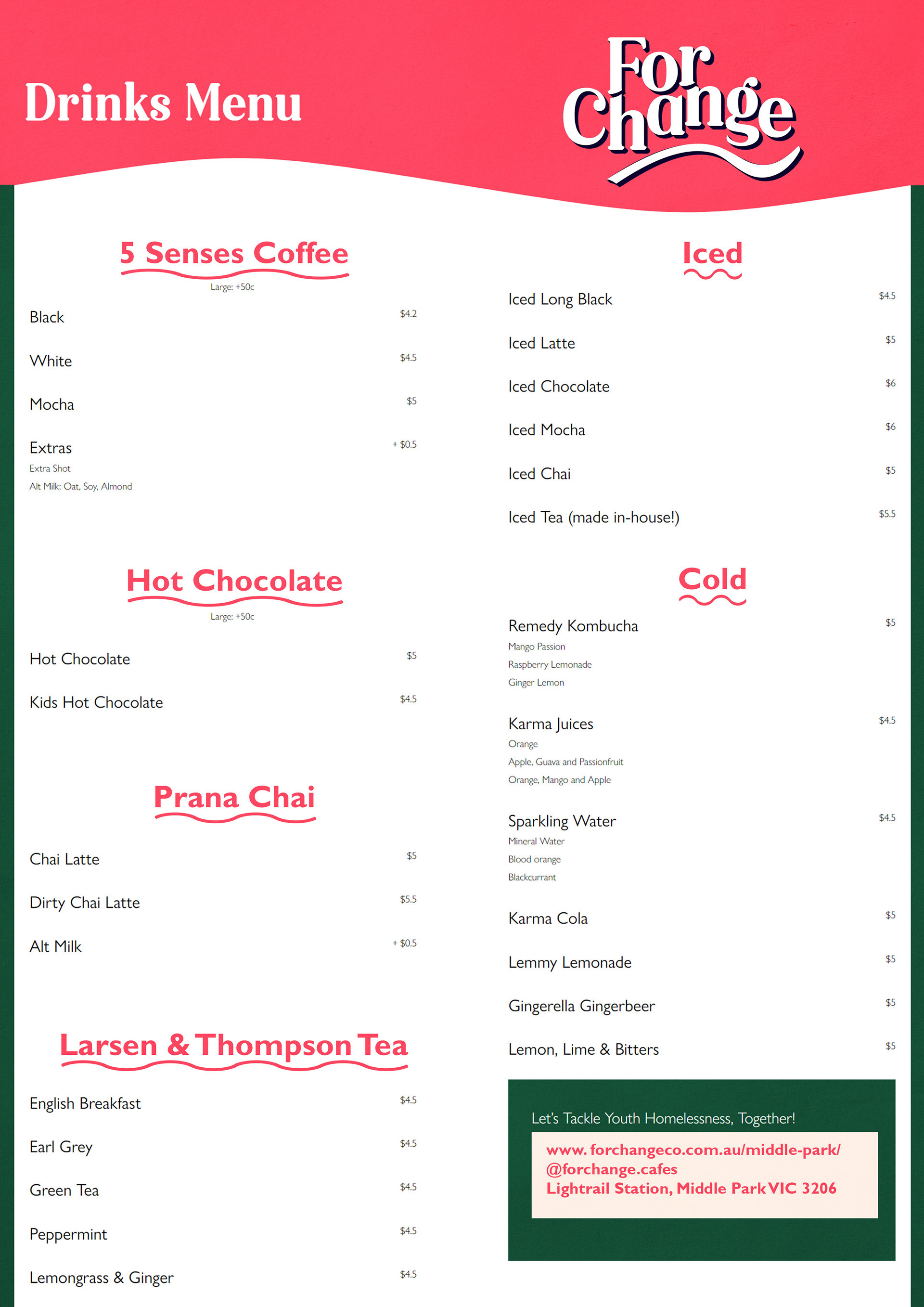
For Change is owned by For Change Co. and is a social enterprise cafe that trains young people to help them escape homelessness. Whilst doing all this good, the cafe serves both Five Senses coffee and healthful plant-based meals.
Put simply, For Change "Serves Coffee and Social Change From a Tiny Railway Building", and this concept brand-identity redesign aims to highlight the cafe's unique qualities.
Analysis of For Change Cafe's branding
I appreciate the visual narrative depicting the journey within For Change café. Emphasizing this concept of a 'journey' for visitors is essential.
The redesigned branding effectively communicates a rich history, local engagement, and a commitment to dynamic change. This strategic approach sets For Change café apart from other cafes and social enterprises in the vicinity.


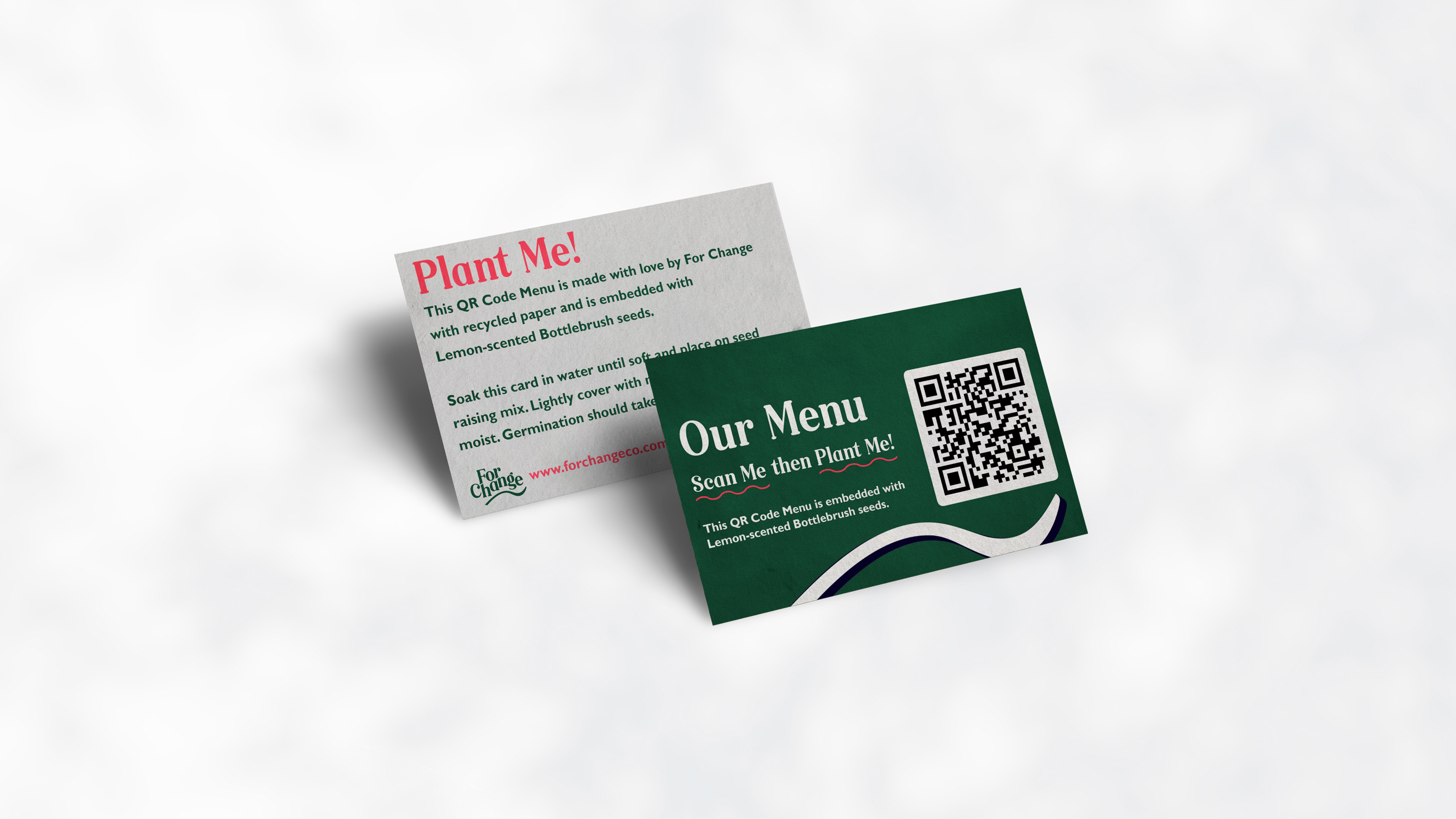

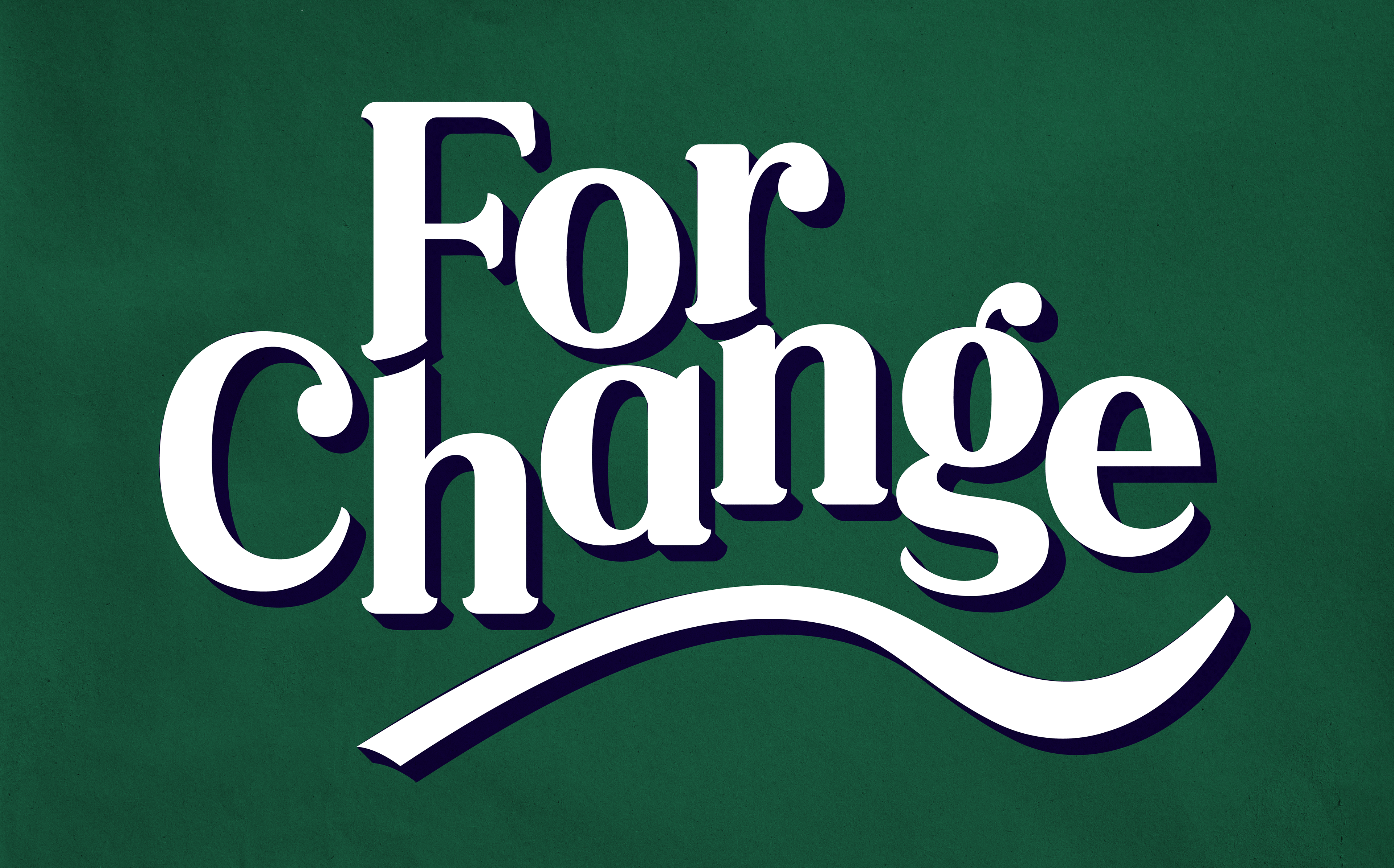
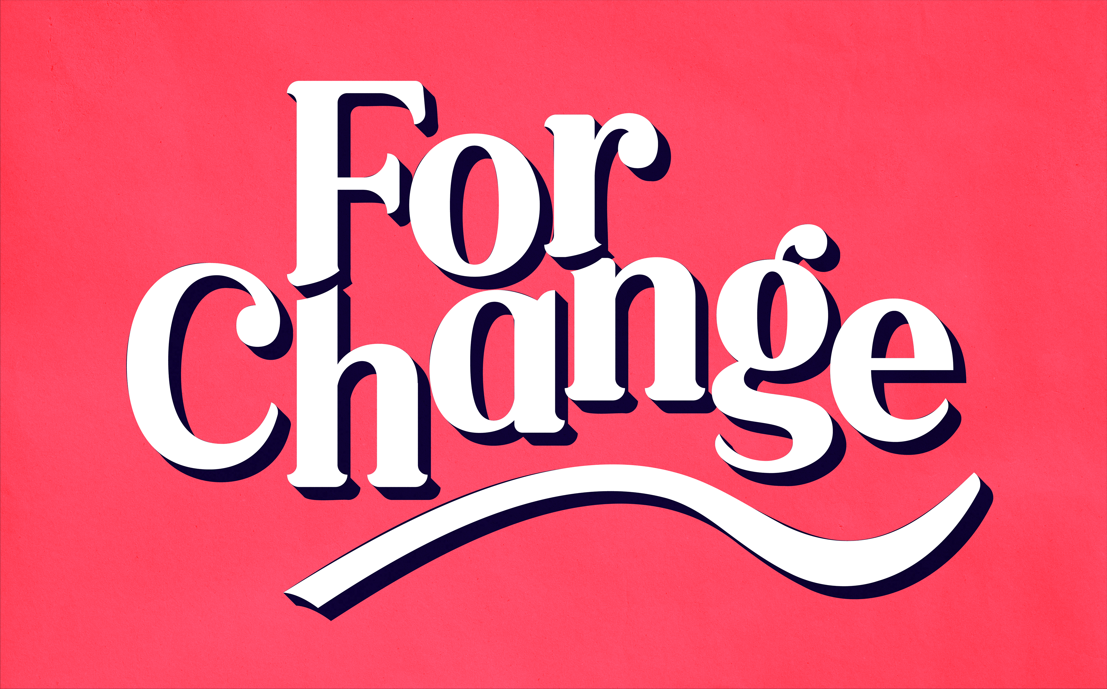
Waves - Journey of a Design Element
Symbolising change, movement, and progress. The undulating line represents a journey, with ups and downs along the way, which can become a powerful symbol of the journey that For Change’s young trainees are on within the For Change development program.
As the For Change cafe is located in a railway building in Middle Park, the wave design is already found in the traditional architecture of the building. By incorporating the design language of the building into the cafe’s brand identity, a cohesive identity system can be created.
The wave design also serves as a nod to the location’s proximity to the ocean, with the undulating line representing the waves - further relating the shape language of the brand to the local area. Additionally, the wavy line has a playful and welcoming feel to it, which could help to create a warm and inviting atmosphere in the cafe.
By utilising and extrapolating upon a distinctive design element like a wave, a memorable and recognizable visual identity for the brand can be created.

Final Design Concept
After extensive research and experimentation, the final concept for the For Change cafe brand emphasises the cafe’s social enterprise mission while also evoking a sense of warmth, comfort, and community.
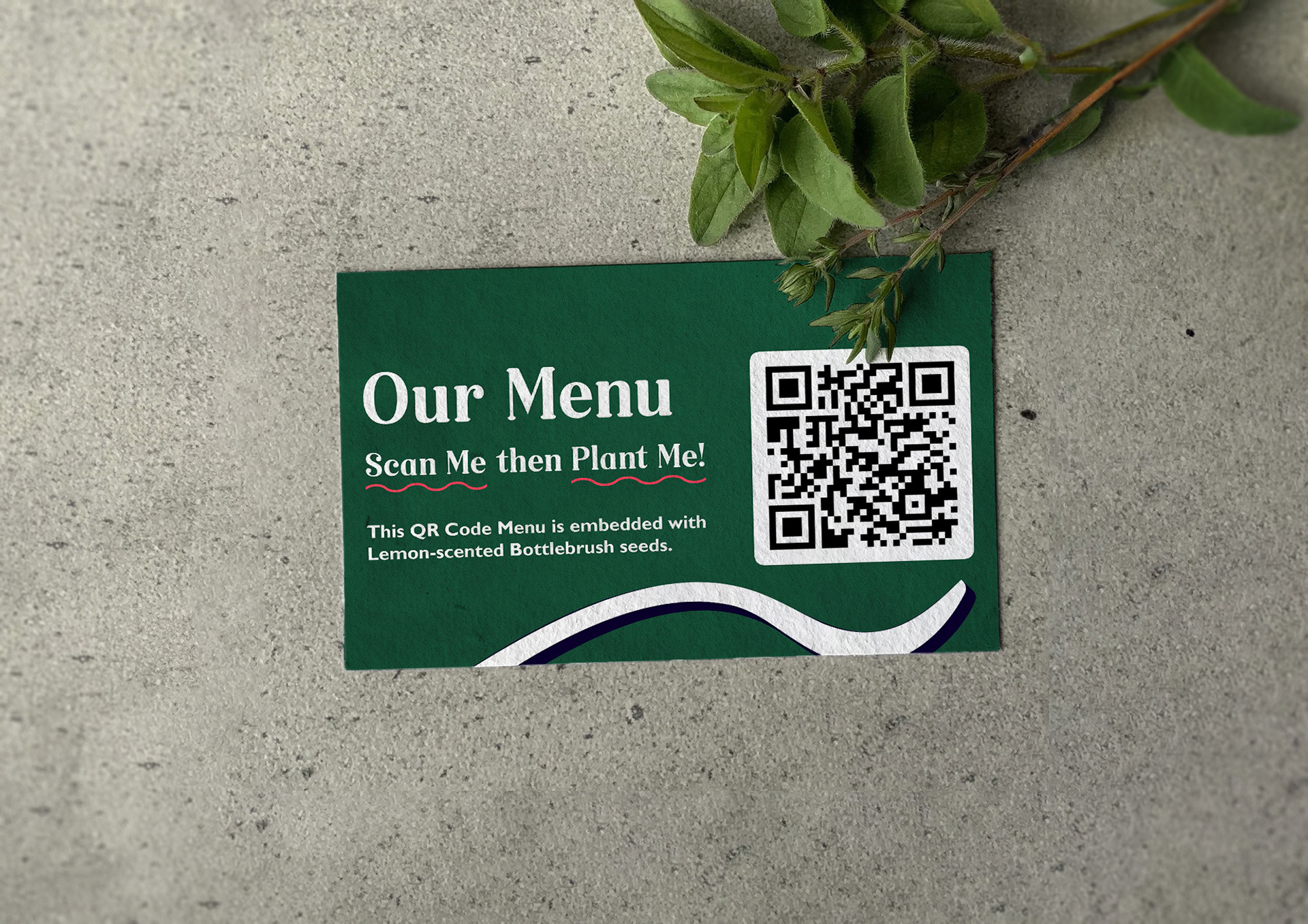
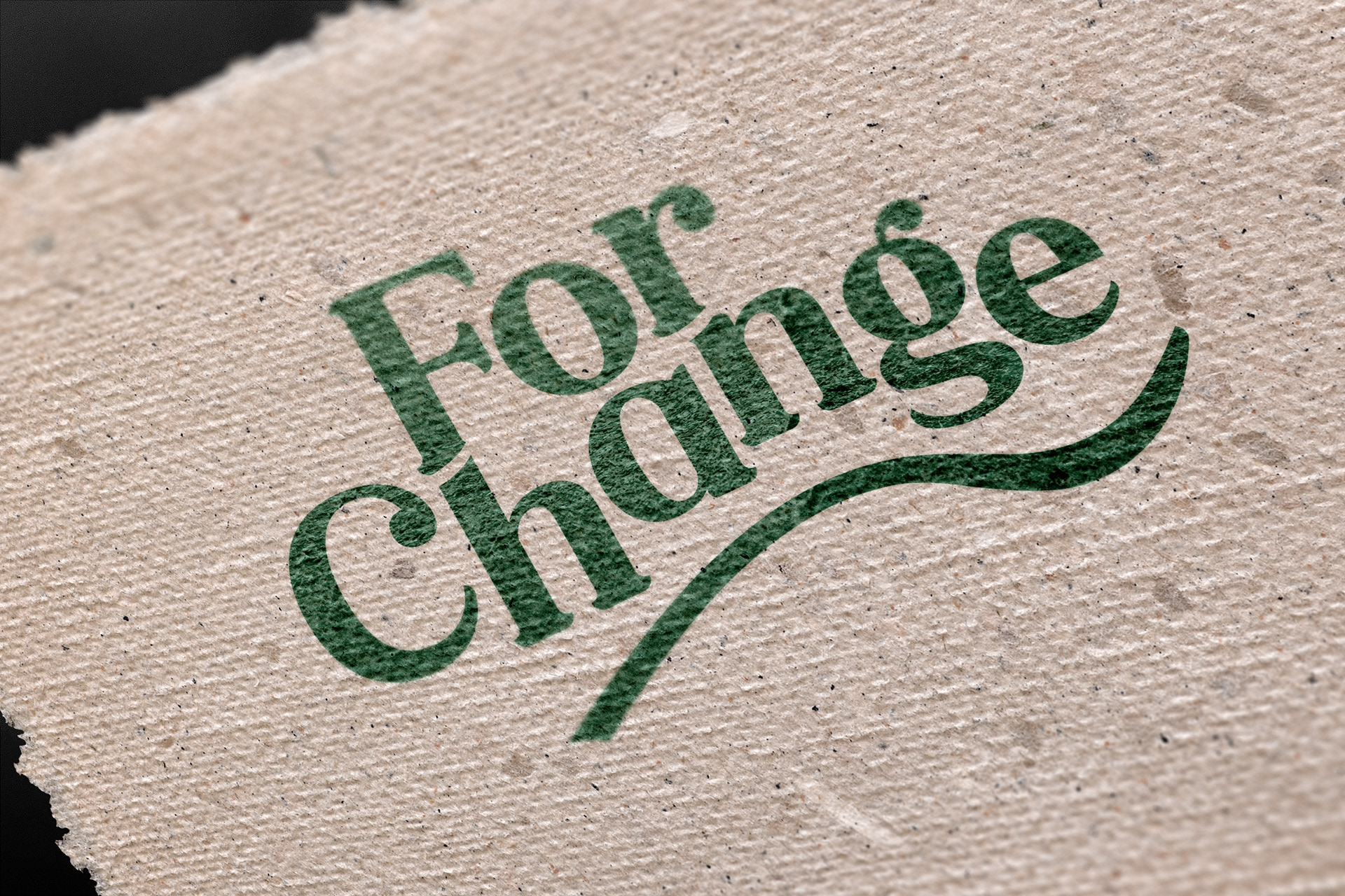
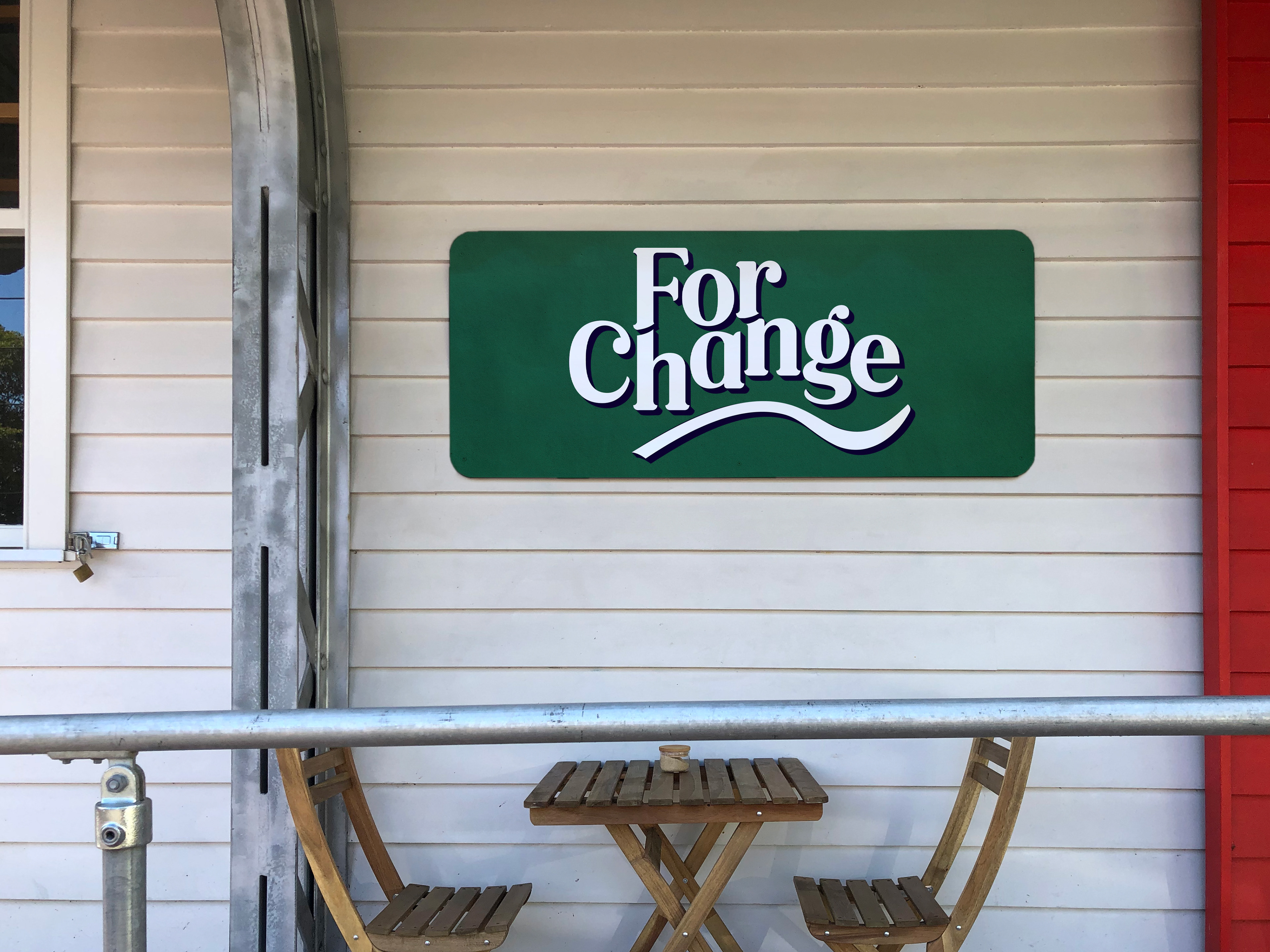
The brand’s visual identity is anchored by a logo that is inspired by Victorian railway station signage, incorporating a wavy horizontal line of varying thicknesses that abstractly resembles a hand holding something. This symbol represents the brand’s commitment to providing a helping hand to young people experiencing homelessness, as well as the warmth and comfort of the cafe itself.
Its name: The Symbol of Change.
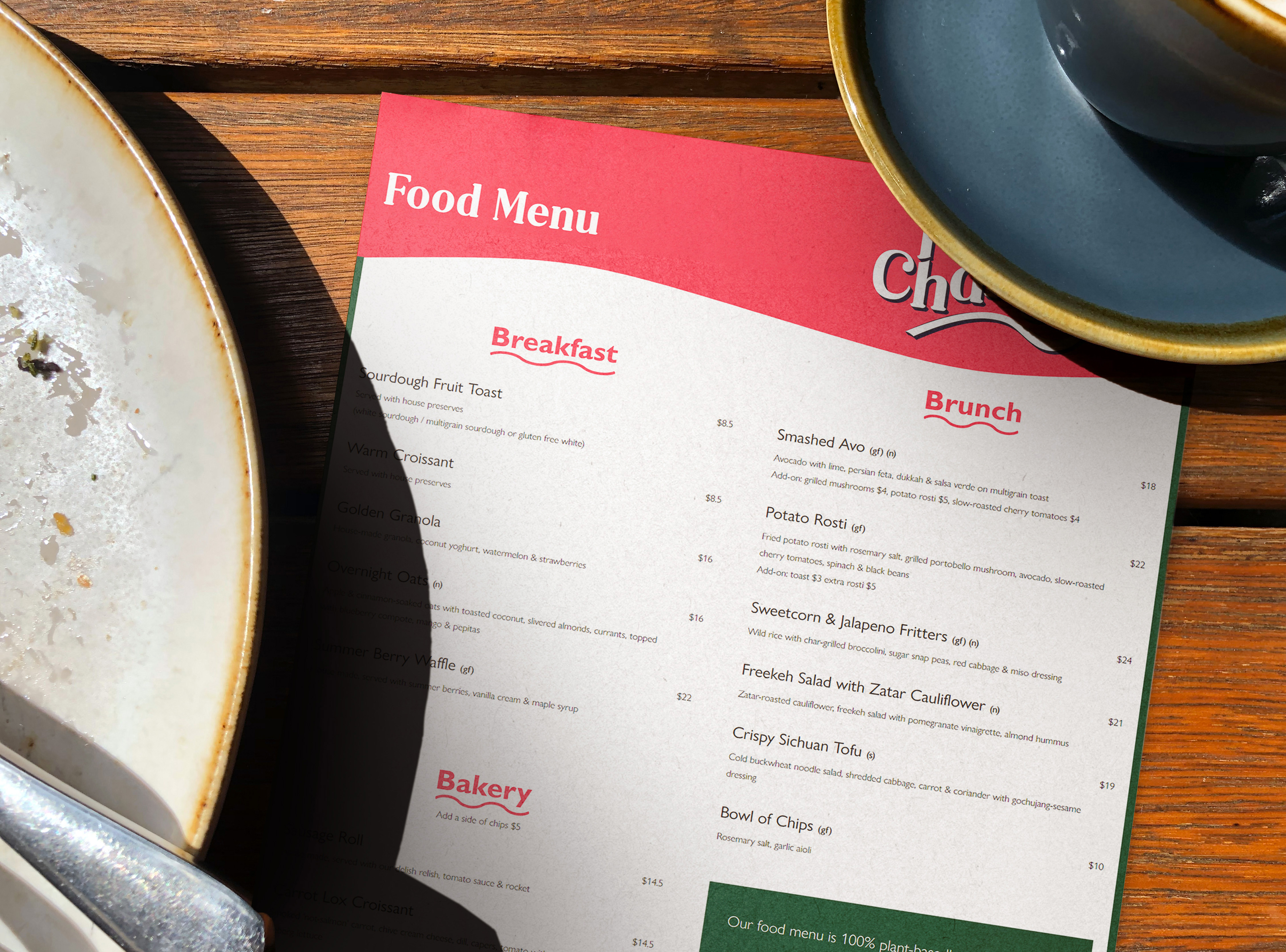
The colour scheme for the brand is a harmonious blend of warm and cool tones, with a deep green and a vibrant red. In addition to the logo and colour scheme, the For Change brand includes graphic elements and typography that are consistent with the brand’s overall aesthetic.
Overall, the final concept for the For Change brand strikes a balance between professionalism and playfulness, while remaining true to the brand’s core mission of creating positive change for young people experiencing homelessness.

Jacques Cooney Adlard: Graphic Design, Website Design, Menu Design, Brand Identity System